Displaying data
- Summary
- We creation summaries or visualizations of data. In our preliminary experiences with data, we have focused on numeric or textual summaries. In this reading and the corresponding lab, we turn our attention to ways to visualize data in Scamper.
Introduction: The potential power of visualization
While a select portion of the population is able to find trends and ideas in numeric data and charts, many find that visual representations of the data present allow them to more easily see possible trends, clusters, and other characteristics of the data. This experience is particularly common when the data sets are too large to think about individual lines of data.
As we explore the power of data science, we have some responsibility to consider how to visualize data. While there are a wide array of visualization tools possible, generally, we will focus on a few core types of visualization. In particular, we will consider histograms (aka “bar charts”), scatterplots, and line graphs.
Showing data in Scamper
In Scamper, the data visulization functions are contained in the data library, so we need to always (import data) at the top of any file for which we want to make a plot. Our major procedure from this library is called plot, and we can create all of the different types of visualizations with this proceudre.
The first parameter to that procedure is a description of the data to
be plotted and the way in which to plot those data. For example, we
describe a scatterplot using dataset-scatter, a line plot using dataset-line, and histograms with dataset-bar.
Let’s start with a simple call to plot-linear to create a plot of a few points.
(In general, we will generate data from our program; this just gets you
started thinking about how things are shown.)
(plot-linear
  (dataset-scatter "Example scatter plot"
    (list (pair 0 20)
          (pair 10 80)
          (pair 13 8)
          (pair 32 95))))
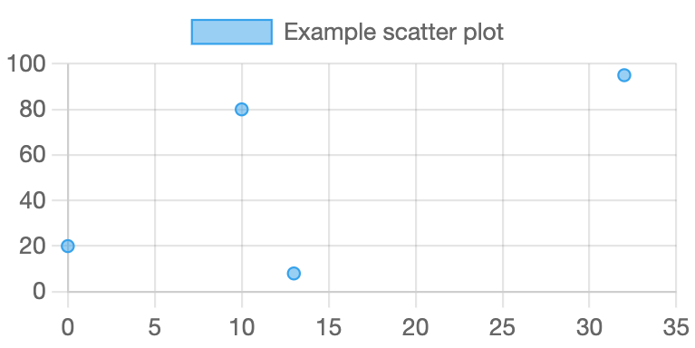
As the image suggests, this expression gives us a fairly simple diagram.
Getting started: Plotting points
As you’ve seen, if we have a collection of points stored as a list of lists of x,y pairs, we can plot that collection with
(plot-linear (dataset-scatter "Title for legend" list-of-points))
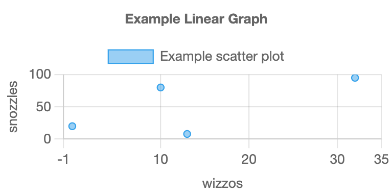
There are several things we might want to customize about this plot: We should name the x and y axes, give a title to the figure, and we might want to change the lower and upper bounds for the axes.
We can do all of these things with so-called optional parameters. The procedure with-plot-options takes two parameters: first a list of the optional settings, and second a plot of some type.
(with-plot-options
  (list
    (pair "x-min" -1)
    (pair "x-max" 35)
    (pair "y-max" 100)
    (pair "x-label" "wizzos")
    (pair "y-label" "snozzles")
    (pair "title" "Example Linear Graph"))
  (plot-linear
   (dataset-scatter "Example scatter plot"
      (list (pair 0 20)
        (pair 10 80)
        (pair 13 8)
        (pair 32 95)))))
Relatedly, we can also make bubble plots, which are very similar to scatter plots except each point also has a weight which determines the size.
(with-plot-options
  (list (pair "x-max" 5)
        (pair "y-max" 55)
        (pair "x-label" "wizzos")
        (pair "y-label" "snozzles")
        (pair "title" "Example Linear Graph"))
  (plot-linear
    (dataset-scatter "scatter"
      (list (pair 0.25 50)
            (pair 0.75 25)
            (pair 0.10 10)
            (pair 3.1 35)
            (pair 2.5 10)))
    (dataset-bubble "bubble"
      (list (list 1.2 15 10)
            (list 2.0 30 5)
            (list 3.75 20 20)))))
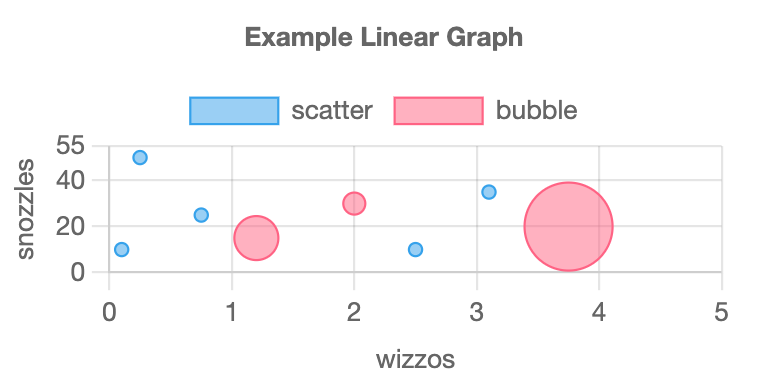
Notice that this example also shows two plots overlaid on the same figure.
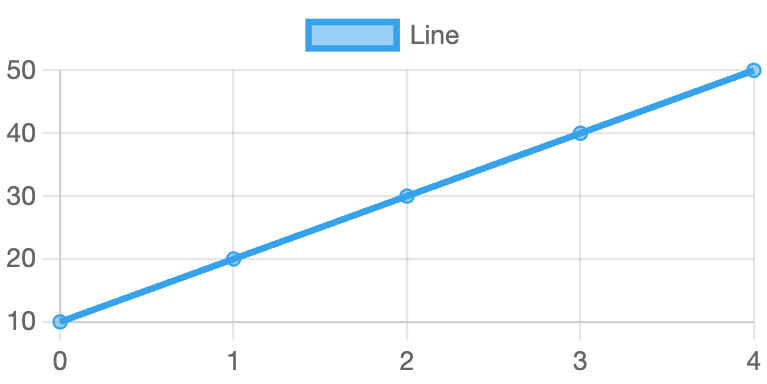
Line plots
Scamper also supports line plots. They act much like scatter plots except that you use dataset-line rather than dataset-scatter.
Here is a traditional line plot.
(plot-linear
  (dataset-line "Line"
    (list (pair 0 10)
          (pair 1 20)
          (pair 2 30)
          (pair 3 40)
          (pair 4 50))))
Bar Charts
Scamper also supports histograms or bar charts. Here is a simple example.
(plot-category
  (list "A" "B" "C" "D" "E")
  (with-dataset-options
    (list (pair "background-color" "blue"))
    (dataset-bar "bar"
      (list 50 10 20 30 40))))
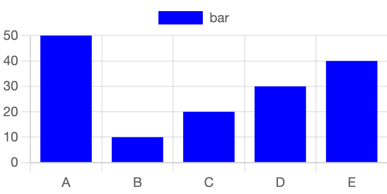
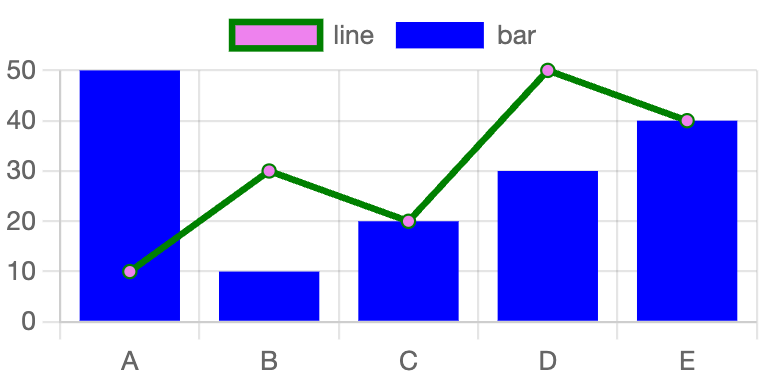
plot-category takes in a list of labels along with 1 or more datasets. If we had line plot data that matched with categorical setting, we can also plot that data using the plot-category function.
(plot-category
  (list "A" "B" "C" "D" "E")
  (with-dataset-options
      (list (pair "background-color" "violet")
            (pair "border-color" "green"))
      (dataset-line "line"
        (list 10 30 20 50 40)))
  (with-dataset-options
      (list (pair "background-color" "blue"))
      (dataset-bar "bar"
        (list 50 10 20 30 40))))
Other options
The data library contains a wide variety of other plotting options and
opportunities, from additional parameters to each of the approaches we’ve
looked at already to other options for plotting data. We will leave you to explore those on your own.
Applying these tools
As you might expect, we will apply each of these approaches to data from our “standard” data sets, such as zip codes or public domain novels. Our first goal will be to determine which visualization might be most appropriate for each form of data. Our second goal will be to turn the data into a form that they can be used by these procedures. Our third will be to use plots to visualize the data.
Self checks
Check 1: Radial Plots
Read about plot-radial on the Scamper documentation page (make sure you’re in 3.2.0 or later!). Verify that these plots work as advertised.
(plot-radial
  (list "A" "B" "C" "D" "E")
  (dataset-pie "pie"
    (list 10 20 10 50 10)))

(plot-radial
  (list "A" "B" "C" "D" "E")
  (dataset-polar "polar"
    (list 10 50 40 20 30)))

(plot-radial
  (list "A" "B" "C" "D" "E")
  (dataset-radar "radar"
    (list 30 50 20 10 70)))
Check 2: Ordering values (‡)
a. Does the order in which we present the points matter in a scatterplot? Why or why not?
b. Does the order in which we present the points matter in a line plot? Why or why not?